
Scandinavian Apartment Interior with Red Accents
- Location: RC Shevchenkovskiy, Kyiv, Ukraine
- Apartment area: 110,8 m²
- Scope of work: Interior design project
Scandinavian Design Beyond Neutral Colors
Most people associate Scandinavian design with natural fabrics, materials and colors. This image is only partly true.
Yes, the Scandinavians, known for their careful attitude to the environment, inherited it from their ancestors, tied to nature by customs, beliefs, legends and, of course, life. Their interiors reflect the same landscapes they see when they step outside of their home. They are filled with flowing lines, biomorphic shapes and colors whose palette reflects natural colors. That is why in Scandinavian interiors, in addition to the calm colors of the earth and greenery, there are always energetic shades of red. It reminds the Scandinavians of rare days filled with light and flames around which their predecessors basked.
Red fills spaces with energy during the long overcast days of the winter season. It has a positive effect not only on the emotional state, but also increases the ability to work. Scientists have proven that even our internal organs are amenable to its positive influence. Red activates metabolism, muscles, blood circulation.
And even though we do not live in northern countries, our winter pleases us less and less with sunny days, so it is worth applying in our interiors the experience that our designers adopted from their Scandinavian colleagues. With red, you need to be correct - its dominant can lead to excessive activity, and, therefore, subsequent fatigue. The designers of the Belik studio delicately introduce it into the palette of the future interior. As in our latest project, an apartment of 110 square meters.
Looking for a Scandinavian-style interior that combines energy, balance and functionality?
Belik Design Studio creates modern apartment interiors designed for real life and future family needs.
We offer full-cycle interior design and turnkey apartment renovation in Kyiv — from concept to realization.

Apartment Interior Designed for a Growing Family
The apartment is located in the Shevchenkovskiy residential complex. The couple, aged 32 and 29, plans to live in it, for whom their future is clear - in the next few years the number of people living in the apartment will increase with the birth of two children and the appearance of a pet.
👉 Book a free consultation and let’s design a space that grows with your family.
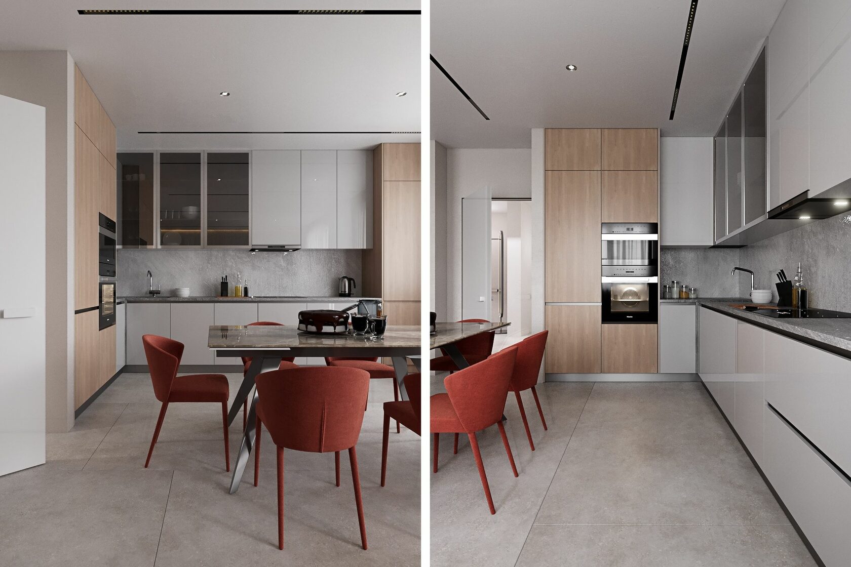
Kitchen and Dining Area with Mixed Materials
In addition to the owners of the apartment, there will sometimes be guests who are gladly received by a young couple. For guests and future family dinners, we have planned a comfortable dining room, which is located in the same space as the kitchen.
The total length of the kitchen is 4700 millimeters. To diversify the interior design of the kitchen, we proposed to use three types of materials for kitchen facades - MDF with a milky white glossy finish, MDF with natural oak textures used in this interior for vertical volumes, and tempered glass for showcases with dishes.

Kitchen Lighting and Zoning Solutions
Spectacular gray backsplash made of porcelain stoneware from the Chinese factory Megagres of the Crystyle collection also contributes to the design of a modern kitchen.

Living Area Flooring and Visual Separation
Along the kitchen working group, we placed the Splitline track magnetic system from the Belgian company Delta Light. The table is illuminated by recessed spotlights from the Polish factory Kanlux.
For the floor of the kitchen of the studio, we offered Spanish porcelain stoneware from the Baldocer factory of the Icon collection in gray.

Hidden Lighting and Concrete Texture Walls
In order to visually separate the spaces of the lounge and kitchen-dining room, we applied different finishing floor coverings. The floor of the lounge area is covered with Polish parquet board Barlinek from the Tastes of Life Biscuits collection from the Grand range of natural oak pattern.

The lighting scenario of the interior of the living room and work area is complemented by LED cords installed in the ceiling moldings.
In addition to the obvious function of hidden LED lighting, there is another aesthetic one - thanks to its uniform light, a textured wall that mimics a natural concrete surface looks more impressive.

Balcony Spaces with Changing Functions
The desire for rational use of space is one of the main directions of modern interior design. It is no longer enough for the premises to effectively perform any one function.
Therefore, we have placed zones in the spaces of both balconies, whose functions may also expand or change over time.
For example, on the balcony, access to which is located in the kitchen, a bar counter is installed, under whose countertop an LED cord is hidden.

On the second balcony, we planned a recreation area. A two-level podium will be mounted at the end of the balcony. In its lower base is a storage box.
Along the opposite wall, we have placed a storage system with closed shelves, where it will be convenient to store seasonal shoes and outerwear.

Entrance Area with Red Accent Details
For the floor of the entrance group, we chose Spanish porcelain stoneware from the Baldocer factory from the Asphalt collection in Fume color, which translates from English as “smoke”.
Built-in busbar lights allow you to create continuous light beams that are necessary for illuminating the room, as well as for orientation in it - they serve as a kind of direction indicators in the room.

In most rooms of the apartment, we placed red color accents that attract attention. In the entrance group, it was a bright red shelf-bench built into the clothes storage system.

Thanks to its unusual oval shape, the mirror has become not only a necessary interior accessory, but also its decoration.

Bedroom Interior with Deep Color Palette
For the bedroom, we chose a rich, almost Rembrandtian palette. The dark colors of the walls look spectacular thanks to the light beams of the LED lighting hidden in the wall panels.

Behind the head of the bed is a wall panel made of Italian Atlas Concorde porcelain stoneware from the Marvel collection in a rich shade of grey.
Opposite the bed, we placed a TV and a hanging shelf under it. Suspended structures avoid the feeling of massiveness when it comes to storage systems, especially when they are placed on the aisle.

Bedroom Storage and Media Zone
By the window, we placed a dressing table with a spacious comfortable chair, for which our designers chose tactile velor in the color of black chocolate.

Bathroom Interior in Marble Textures
On an area of 5.8 square meters, we placed a full-fledged bathroom, plumbing equipment with a hidden installation, a high cabinet for storing detergents and a wall cabinet for a sink.
For the walls, we chose Spanish porcelain stoneware from the Almera Ceramica factory from the Aston collection, imitating natural marble.
The purity of the marble pattern is emphasized by the porcelain stoneware decor of the same Almera Ceramica factory of the Crestone collection.

Children’s Room Designed for Two Kids
The area of the children's room is quite large - it is almost 21 square meters. They turned out to be enough to place storage systems, a workplace and sleeping places for two children on it.

The steps to the top floor hide boxes for storing toys and books. Our designers have individually developed this children's recreation and play complex for this interior.
We decided to make the entire interior of the nursery in neutral white and mint colors, in which every child, regardless of gender, will feel comfortable.

Play, Study and Storage Zones in the Nursery
Two working areas are spaced opposite each other on both sides of the window. Children of different ages will follow different work schedules. Our designers, thanks to their experience, have provided for this.

Our designers are confident that children will be delighted with the sports corner, which is equipped not only with a traditional Swedish wall and a soft mat for their safety, but also with a small climbing wall.
To the right of the entrance door there is a spacious wardrobe 2 meters long for children's clothes and shoes. We offered white matt facades for it with grooves made of texture imitating natural wood.

For the guest bathroom, we chose tiles from the Spanish factory Baldocer from the Queensland collection.
The cold pearl surface of the tile looks especially impressive next to the warm wooden surfaces of the furniture facades.

Balanced Apartment Layout and Zoning Logic
Due to the symmetrical arrangement of the rooms relative to the central axis, on which the entrance door to the apartment is located, our designers managed to create a balanced space. Its left side is given over to the bedrooms of the owners and their future children. On the right they will receive guests and relatives.
🔗 See also:
— Apartment Interior Design
— Turnkey Apartment Design
— BELIK Studio Portfolio
Why should you choose us?
Sign up for a FREE consultation at a convenient time for you and in a convenient way