"Blue stocking". "Blue Beard". "Blue bird". The name of this color has firmly become part of our everyday life, like himself.
Did you know that blue hasn't always existed? Exactly! Scientists wondered why, for example, Homer in The Odyssey compares the color of the sea with the color of wine. Upon closer examination, it turned out that in the poem, where the action takes place at sea, in nature under the sky, the blue color is never mentioned. Further more. They write that in none of the ancient languages, such as Hebrew, Greek, Chinese, Latin, there is a word for the definition of blue. Red, black and white colors have several definitions. Blue has none.
The ancient Greeks had one word that they used to describe things brown, blue, purple and black. But how did they say that it was definitely blue. It will seem funny to you, but they could call a bright blue periwinkle red, green or even black.
There were no images of blue in the wall paintings of the Paleolithic and Neolithic times. In the works of ancient authors, those phenomena that we habitually consider blue are called dark red. The only civilization that distinguished the color blue was in ancient Egypt. Scientists have not yet come to a unanimous decision whether the paint was extracted from local plants or brought from India.
It is believed that for the first time the definition of blue was given in the Middle Ages. And now we live in a world in which there is a variety of colors, including many shades of blue. We will name only the most common of them: turquoise, woad, named after the plant Woad dye, which was used in ancient times for dyeing fabrics, indigo, cobalt.
There is also a Labrador. Surprised? It was named after the mineral first discovered on the island of Labrador. By the way, we also have its deposits in Ukraine, in Volhynia. There is International Klein Blue, patented in 1960 by artist Yves Klein.
In our new project, we used several complex shades of blue. Let's see what colors we painted the interior of the apartment, which is located in the Galaktika residential complex.

The future residents of the apartment will be a married couple of 45, 38 years old and their four-year-old son. They do not plan to stop at one child, dreaming of expanding their family circle. And he, apparently, is not small with them - the mother of the owner of the apartment often comes to them for several months, often in the evenings they receive the sister's family with two children.

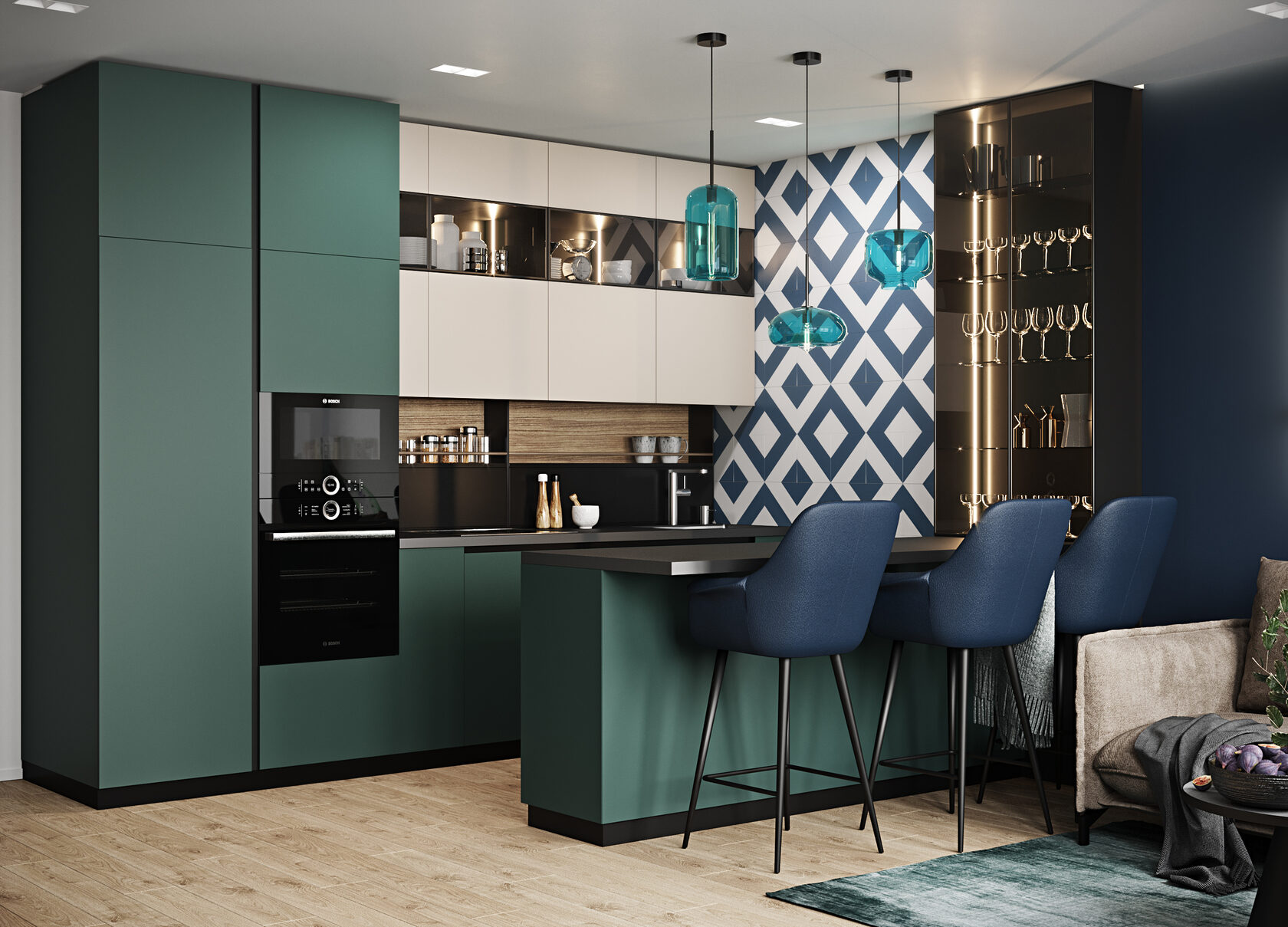
The total area of the kitchen-studio is 24.4 square meters. On them we placed a seating area with a large, unfolding sofa, a kitchen, a bar for quick breakfasts and a dining table.
The floor of all living rooms of the apartment, as well as the entrance group, is covered with laminate from the Polish factory Kronopol. From its range, we have chosen the Parfe Floor collection, which is known for its multi-layered structure, which ensures its long service life, which lasts 20 years.

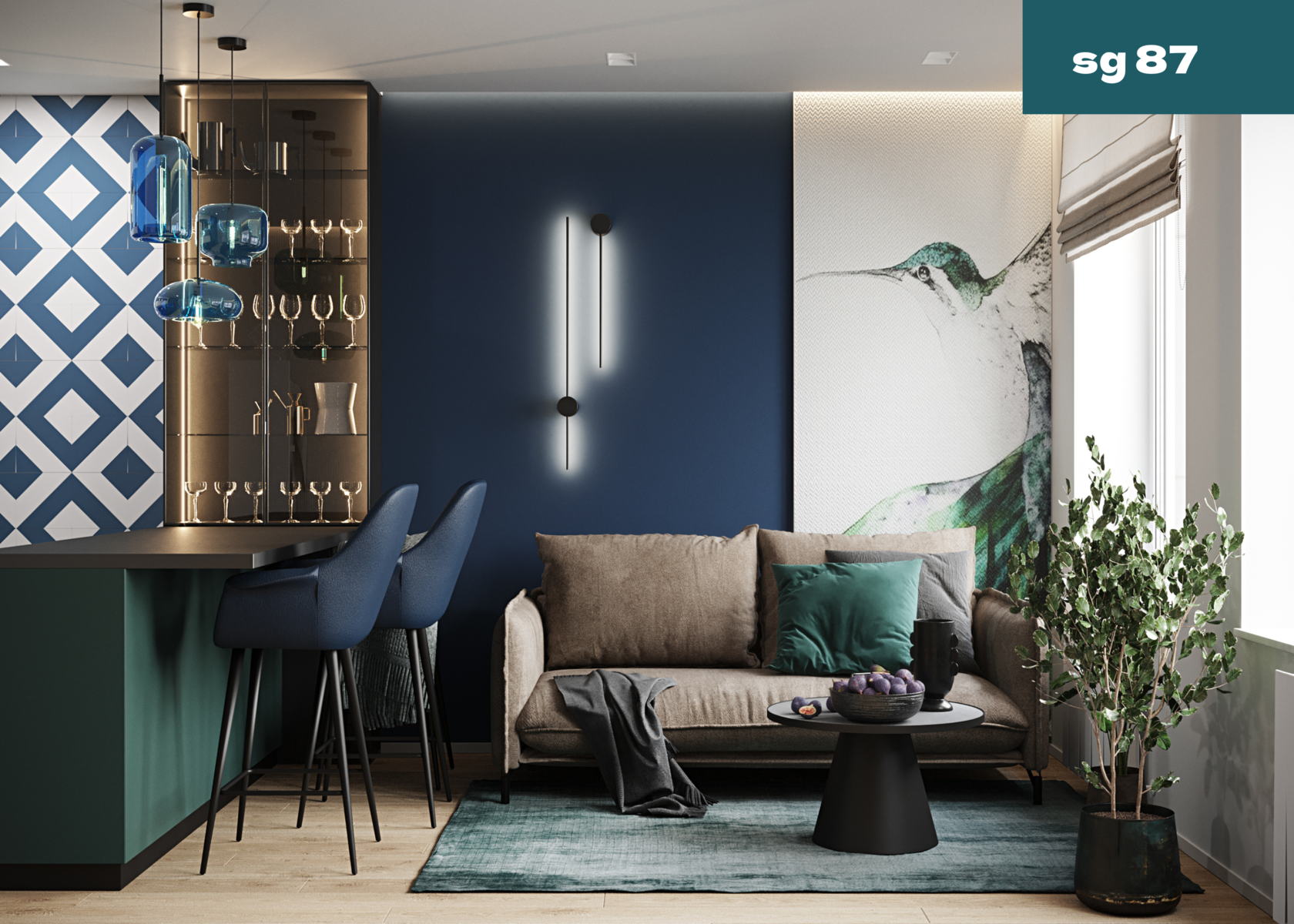
The photo shows that we built the design of the kitchen based on the play of three interesting shades of blue. "Blue dust" is the name of the color chosen for the wall and upholstery of the bar stools. The wall tile pattern combines milky white and sea green. It was created at the Spanish factory Pamesa. It is part of the Artsract collection.
In azure gray, the kitchen fronts are made, with which the pillows and the carpet echo.

You must have heard about the art of origami. Naturally, it appeared in ancient China, in the same place where paper was invented, from which figurines are made. However, now the origami master has gone beyond the traditional material.

Umut Yamaka created a limited edition of lamps based on origami back in 2014. After that, the Dutch company Moooi drew attention to it, which introduced Yamaka lamps into its permanent collection. We decorated the dining area with sconces from this collection.
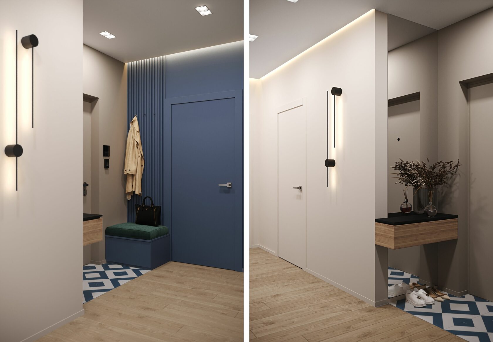
The entrance group was decorated with two sculptural sconces Black Lines from the Anzazo factory.
The latest trends in interior design show a complete rejection of ceiling moldings. Not everyone can afford it. Often, moldings are needed to hide the unprofessional work of the craftsmen, which is especially evident at the junction of the wall and ceiling. Our builders create perfect surfaces. Their professionalism allows our designers to develop complex design solutions.

Lighting in the corridor is created by double built-in lamps from Azzardo.
We developed additional lighting with the help of built-in LED cords hidden in niches between the ceiling and walls. The implementation of such solutions requires special professionalism from the builders.
Call us at the studio, we will tell you how much a turnkey repair costs in Kyiv, we will break down the cost of a design project in Kyiv and other cities into components, we will show you 3D interior design projects.

On both sides of the bed, we placed Fabulo pendants of various shapes and colors. We have selected the main shades of gray and green colors that dominate the interior of the bedroom.

The green color of the ceiling perfectly matched the color palette of the picture placed at the head of the bed.
As you have already noticed, in the bedrooms lately they are increasingly abandoning the central chandelier in favor of hanging lamps by the beds.

The walls separating the bedroom from the dressing room are covered with wooden panels, whose color and texture are completely identical to the laminate.
We chose a similar material for the implementation of shelves and a dressing table placed opposite the bed.

The feeling of lightness of the shelves is given by hidden lighting, which is created by LED cords hidden at the bottom.
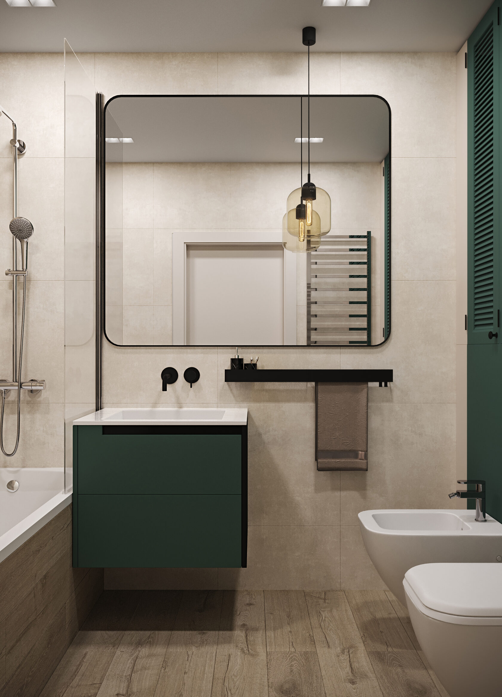
Balloon in Japanese sounds like the English word “awa”, this is the name of the lamp that we proposed for the bathroom.

The lamp was designed by Japanese designer Fumie Shibata for the Czech company Brokis.
Did you think that we used wooden panels for the bathroom? Not at all. This is porcelain stoneware from the Spanish factory Grespania from the Selva collection.

And we did not leave the bathroom without blue. For her, we picked the color of the “water of Bondi beach”. This color is a combination of red, green and blue.
Are you wondering where the beaches of Bondi are? "Bon dai" in the Australian Aboriginal language means "wave breaking on the rocks." This is one of the most popular beaches in Sydney, known since 1882.

We turned the wall at the head of the sofa into a kind of decor, creating a vertical composition on it.

By the sofa, we have placed a tall bookcase whose fronts combine polar black and white, creating an interesting graphic effect.
To illuminate the sofa in the guest room, we chose the Ideal Lux sconce.

The owners of the apartment are planning a second child in the near future. We took this fact into account when working on the design of the apartment.
We have placed all the necessary furniture that a growing child will need. The interior will be completed at the right time with everything necessary. A few accessories and details will turn it into a comfortable children's room.

Unified furniture solutions, such as a desk that turns into shelves, shelves that flow into a chest of drawers, create a harmony of space, do not split it into small components. In addition, they are easier to clean. Our designers develop unique furniture solutions for each interior individually.

The Rig Color Surface Mounted Ceiling Light maintains the shape of a circle, which is considered the most comfortable for human perception. It calms and balances, which is very important for a hyperactive boy.
The child's bed is illuminated by the Colors wall lamp from the Anzazo factory. Its asymmetric unusual shapes have turned it from an ordinary lamp into a real work of art that attracts attention. We believe that good taste should be developed from childhood.

Literally translated, tie-dye means tie-dye. This was the name of the technology for obtaining unusual complex color overflows. It is usually used when dyeing with different colors, but recently monochrome tie-dye, such as on the carpet in the nursery, has attracted more and more admirers.
We have integrated the table into the storage system, making it part of the work area. This will save space and make the space harmonious.

Sports corners have not yet become a familiar part of the interior of a children's room. However, we are receiving more and more requests to plan a place for children to play actively.
In this nursery, we placed a wall bar with a horizontal bar, which can be supplemented as the boy develops.

For the floor of the shower cabin, we offered the Spanish porcelain stoneware from the Geotiles factory, the Tabula collection.
The floor of the main bathroom is lined with porcelain stoneware from the Italian factory Ragno of the Xt20 collection.

The soft cream-colored tiles of the Alpha collection were created by the Spanish factory Atrium.
The wooden texture of porcelain stoneware is easily confused with natural wood. It was produced by the Spanish company Grespania. Her Selva collection is known to all lovers of natural materials.

Since 1964, the Spanish company Mainzu has been known for its aesthetic and high-quality porcelain stoneware.
For this interior, we proposed the Catania collection in blue.
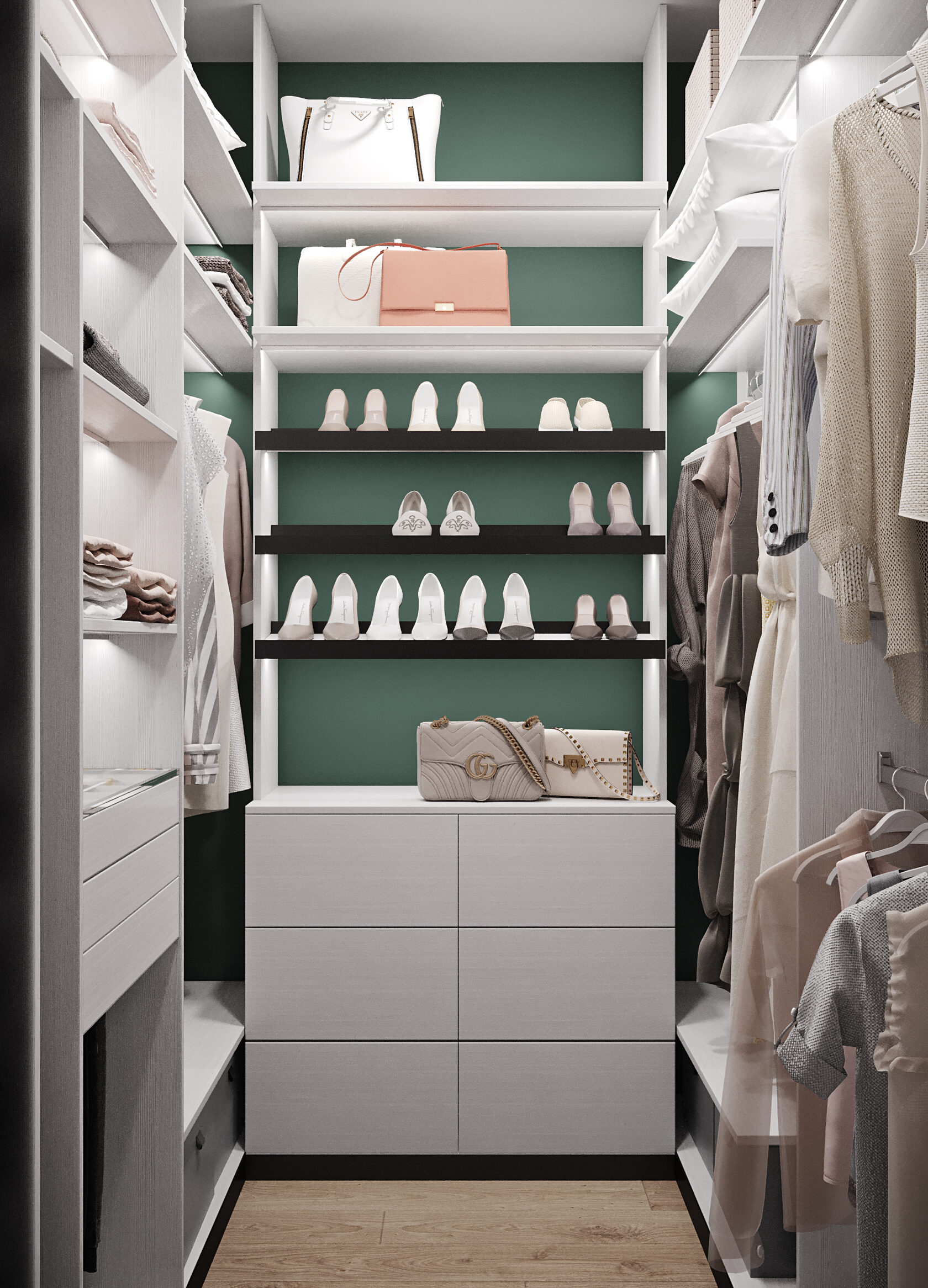
The wardrobe in this project was planned exclusively for the owner of the apartment. We have developed a unique project, which took into account all the features of her wardrobe.
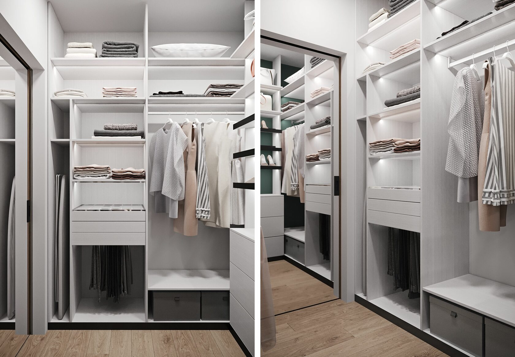
We gave the main area for closed and open shelves, convenient for storing woolen products, sportswear.
A mirror is an essential wardrobe accessory. Ideal is a mirror to the floor. We installed it in the door, saving usable space.

Storing shoes is a task with an asterisk. We solved it by offering comfortable, roomy shelves located at an angle.
We gave the lower shelves for boxes with seasonal shoes that do not need to be taken out every day.
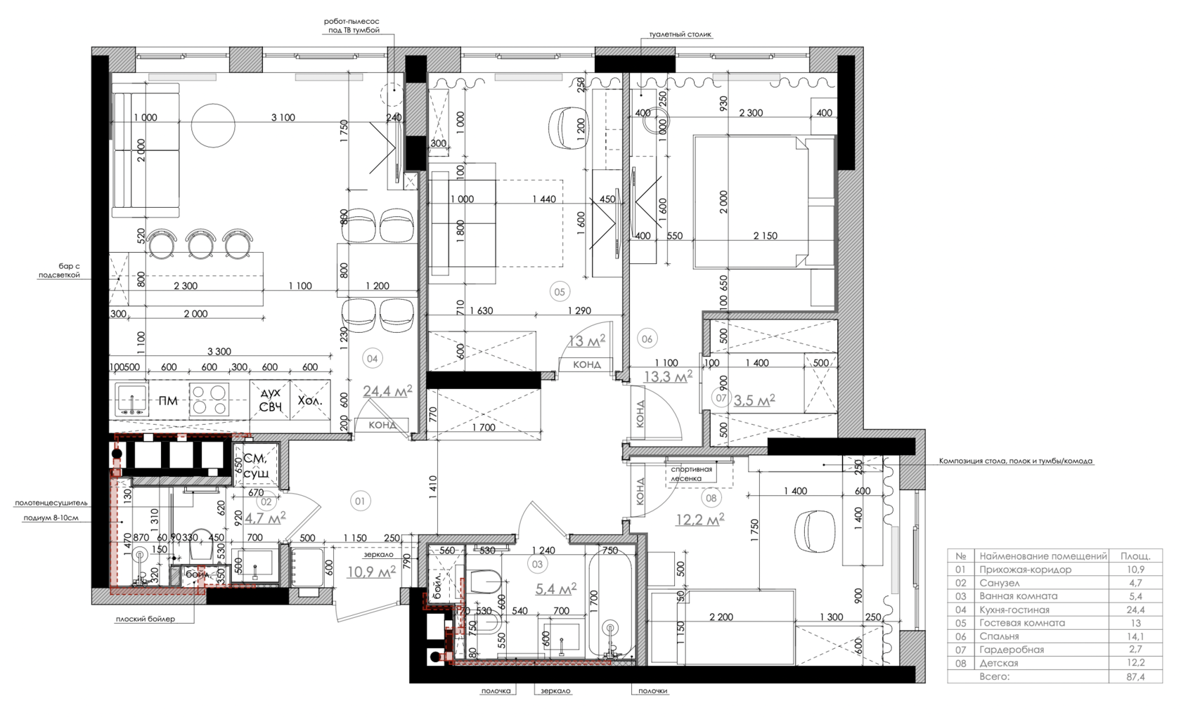
One of the most ideal planning solutions is the location of common spaces right next to the entrance to the apartment. We made several redevelopment options before we reached the right decision - the reception area is located directly opposite the front door. The rest of the space is located further down the corridor.
Why should you choose us?
Sign up for a FREE consultation at a convenient time for you and in a convenient way