
Minimalist Apartment Interior Design in Galaktika Residential Complex
- Location: RC Galaxy, Kyiv, Ukraine
- Apartment area: 72,5 m²
- Scope of work: Interior design project
Minimalism as a Philosophy in Interior Design
At the heart of all minimalist interiors is the principle formulated by Ludwig Mies van der Rohe back in the first half of the 20th century - “Less is more”. He is considered one of the most influential reformers in architecture. He opposed any desire for embellishment that had no practical value.
The house, in his opinion, should consist of skin and bones, where steel plays the role of bones, and glass plays the role of skin. He advocated free planning. A single space, where there are no permanent partitions, he proposed to divide with mobile screens or curtains.
Not in such a maximalist version, however, his free-planning ideas are being realized today. Also like many others.
You have noticed that recently one-story houses with flat roofs have increasingly dominated in private construction. This type of design was first supported by the teachers and students of the Bauhaus, a school that was established in Germany in 1919 and whose last leader was Mies van der Rohe. The school became famous not only as a hotbed of new functionalist architecture and minimalist aesthetics. It had reformist teaching methods, which were expressed in the freedom of communication between teachers and students, joint parties, theatrical performances, performances, performances.
Looking at their miraculously preserved photographs, you see an extravaganza, a holiday where irrepressible fantasy triumphs. And here you start to wonder if “less is more” really. Although Mies van der Rohe himself neglected decoration, he used natural stone with a generous hand, whose natural textures are an ornament in themselves.
Let's take one of his projects, the Barcelona Exhibition Pavilion, designed for the World Exhibition, which took place from 1929 to 1930, and look at the materials used by the architect: travertine, onyx, fabulous green marble, whose pattern replaces the most impressive canvases. The interior uses glass partitions in muted green and smoky colors. The walls of the pool are decorated with black glass. Luxurious, right? So, let's assume that Mies van der Rohe, if not cunning, then provoked the public by throwing such phrases. Moreover, a couple of decades have passed and in response to the already legendary words “Less is more”, no less canonical “Less is boring” sounded. They were said by the architect Robert Venturi.
Belik studio designers know how to make minimalism interesting, varied and exciting. We are ready to show you an example of a design project in the Galaktika residential complex.
Looking for a minimalist apartment interior in Kyiv that feels warm, modern and functional?
BELIK Interior Studio creates thoughtful minimalist interiors with precise layouts, smart lighting and turnkey renovation.
👉 Book a free consultation to design your apartment in Galaktika residential complex with clear pricing and professional implementation.

Modern Interpretation of Free Planning
The area of the apartment is 72.3 square meters. Its owners are a married couple of 32 and 28 years old with big plans for the future: to get a cat and give birth to a child. In the meantime, they will live in an apartment together, receiving guests on weekends, friends who come to spend free evenings together. Their preferences in the interior are modern apartment design.

Kitchen–Living Room in Minimalist Style
For their parties, we created a 20.2 square meter space that includes a kitchen, dining room and living room with a large corner sofa. The design of the kitchen-studio is very discreet. It includes a maximum of furniture and appliances important for the space, a minimum of decor.

Above the dining table, we placed a Siris pendant lamp, consisting of two parts - a ring and a slat. Its shape transforms it from a simple chandelier into an interesting art object that seems to symbolize the masculine and feminine, softness and restraint. In the kitchen space, light, in addition to the ceiling mounted chandelier, is created by Philips overhead double luminaires.
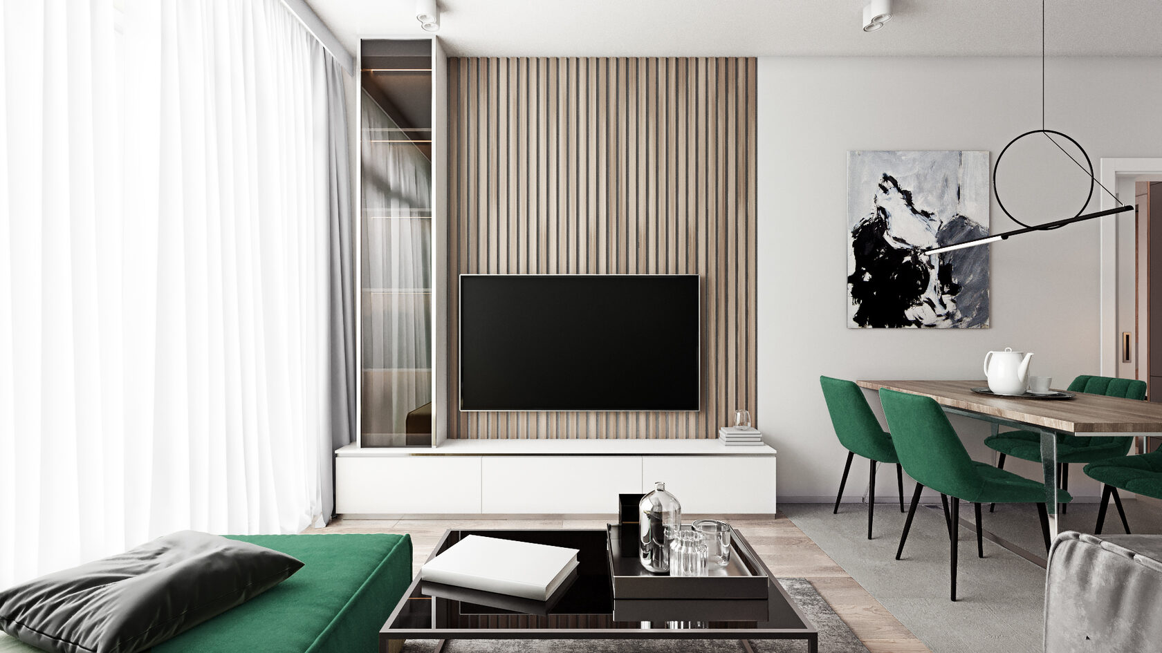
Accent Color as a Tool Against Boring Minimalism
Of course, you have already noticed the malachite green upholstery of the chairs and the sofa. This is our homage to malachite, which Mies van der Rohe used in his Barcelona project. The rich green of this shade makes the interior not boring, leaving behind it the right to be minimalistic.

Lighting Design as the Main Decorative Element
We have repeatedly explained the reasons for our commitment to Spanish porcelain stoneware. It will not be superfluous to briefly list them again. First, the natural location of raw materials. Then, the historical traditions, which made it possible to hone the professionalism of the masters. Mixture of opposing cultures. And finally, modern technology. This project has become another one in the pool of interiors in which we used Spanish porcelain stoneware. This time our choice fell on the Baldocer factory and its Arkety collection.

Entrance Hall Design with Integrated Storage
The entrance group is separated from the kitchen-living room by a conditional door, which moves during the visit of guests and turns the entire space into a single interior. To emphasize its commonality, we used identical materials for the walls, floor and the same lighting.
Corridors with many doors are always a difficult story. One of the best ways to “lighten up” a space that has entrances to several other rooms is to match the same materials for the walls and doors. In this case, the doors are not so obvious and the interior looks more relaxed.

Visual Unification of Corridors and Doors
The entrance hall is located on an area of 8.8 square meters. We settled on a calm color palette, giving preference to light tones, dark we left the ends of the furniture and small details. Thus, we created a graphical contrast between light and dark.

American architect, also called the "father of skyscrapers", Louis Sullivan argued that form follows function. The function of the hallway is clear - you need space to leave outerwear, dress comfortably and leave the apartment or go further into the rooms. In order to implement these functions, we placed large storage systems in the entrance group.

The dark facades of built-in wardrobes with rhythmically alternating door leaves create an interesting effect against the backdrop of snow-white walls.

Balcony Design as an Additional Lounge Area
For the balcony, as well as for the living areas, we offered a Belgian laminate in the color of Cambridge oak from the Largo collection from the Quick-Step factory.
We placed niches for books, flowers and several bean bags on the balcony, creating a cozy seating area.

Bedroom Interior in Minimalist Aesthetic
The bedroom area, 17.8 square meters, was enough for our designers to place a full bed, a dressing table, a work area, hanging shelves and a built-in wardrobe for clothes and bedding.

On both sides of the bed, we placed spectacular ceiling lights in the form of Halo Lights light rings of different diameters.

The entire color palette of the room is based on contrasting the warm tones of the wall panel, floor, bed and lighting with the cool colors of the furniture and fabrics.

The dressing table to the right of the bed is illuminated by an LED cord that we installed directly into the mirror.

Carpets appeared in the 6th century BC. Initially, they were needed to protect residents from cold walls, drafts and wind. Now the need for this type of protection has disappeared. However, the desire to immerse yourself in an atmosphere of comfort and coziness is still relevant. Therefore, we placed a carpet in the bedroom that imitates vintage samples of the last century. Decorating a bedroom requires our designers to understand the preferences of customers and knowledge of the most fashionable trends.

Neutral Children’s Room Design for the Future
As we have already said, our customers are still planning to replenish the family, so they set us the task of creating a style-neutral children's room that would suit both a boy and a girl.

The area of the children's room is 15.2 square meters. We put a sofa on them, on which it will be convenient for parents to relax in order to be closer to the child, a working area, shelves for books and toys.

So far, only a funny lamp in the form of a sitting hare reminds that the children's room.

Opposite the sofa, we placed a TV with a hanging shelf. Subdued light in this area of the children's room is created by an LED strip hidden in the ceiling molding and LED cords embedded in a wooden wall panel made of chipboard rails.

The effect of the diffused light of the LED strips is enhanced by Philips ceiling mounted lights installed around the perimeter of the room.

In addition to bookshelves, we placed a built-in wardrobe for clothes and shoes in the children's room.

Minimalist Bathroom Design with Spanish Porcelain Tiles
For the bathroom floor, the designers of our Belik studio offered porcelain stoneware from the Spanish factory Baldocer from the York collection.
To continue the minimalist style that we embodied in the rest of the apartment, we chose the same Spanish factory Baldocer York collection in Navy and Arian colors for the bathroom walls.

One of the most striking details in the bathroom is the light ring built into the mirrored surface. From a purely functional element, it has turned into a room decor.

The bathroom in the apartment is small - only 1.4 square meters. As a floor covering, I chose porcelain stoneware from the Baldocer Iron collection.
The walls of the bathroom are decorated with tiles from the Spanish factory Baldocer, the Storm Natural collection.

Functional Zoning of Public and Private Areas
The layout of this apartment took a short amount of time to work thanks to the correct room sizes and conveniently located wet and living areas. We divided the entire space of the apartment into public and private parts, which has a beneficial effect on the atmosphere in the family.
🔗 See also:
Why should you choose us?
Sign up for a FREE consultation at a convenient time for you and in a convenient way